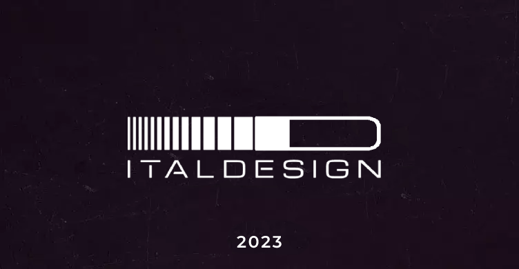
Over the years, Italdesign Giugiaro has evolved and expanded in terms of the services supplied and the number of its employees, plants and operating premises, and the logo has changed accordingly:
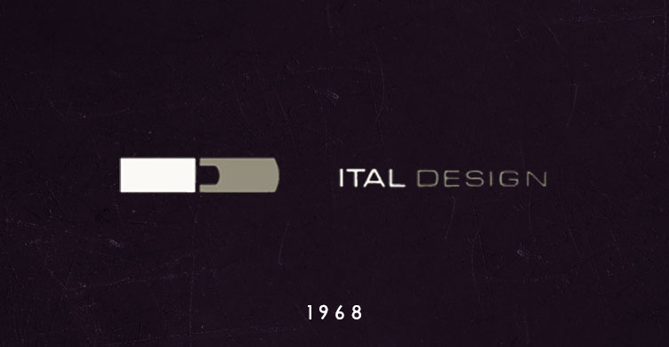
13 February 1968
Giorgetto Giugiaro and Aldo Mantovani launch their own business. The new Studio provides its services directly to the car industry offering a professional team with experience in the creative and engineering fields, construction of models and prototypes, design of dies and tooling for industrialisation, as well as advice on production methodology. The company’s name and logo are intended to be easily identified and to convey its distinctive credentials and mission: Ital Design.
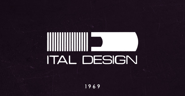
1969
The logo undergoes a transformation: The ‘I’ and ‘D’ are re-stylised and the Ital Designwording is positioned beneath the two letters set in ‘block type’.The letter‘I’ is defined using the vertical ‘sticks’ for the first time. It starts off with 17.
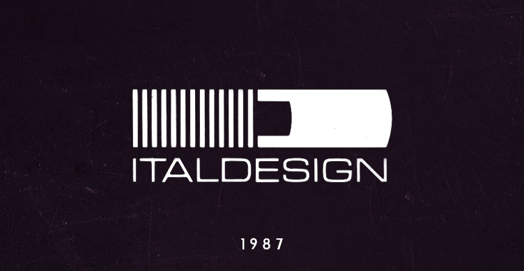
1987
The company name changes to Italdesign and so the logo also contains the two combined terms. The 17 vertical ‘sticks’ drop to 13. These still exist today and relate to the date the company was set up
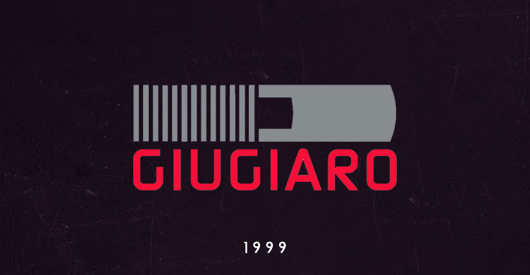
1999
The Company is listed on the Italian stock exchange and changes its legal name intoItaldesign Giugiaro S.p.A. The logo changes accordingly. The logo undergoes a radical change with ‘Giugiaro’ written under the two stylised letters. From the traditional use of black, the brand now combines two colours, red and grey.
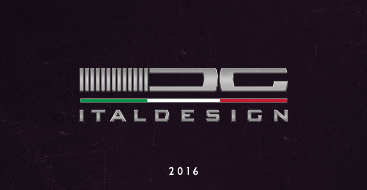
2016
The new logo pays tribute to Italdesign’s roots, those planted by Giorgetto Giugiaro and Aldo Mantovani in 1968 to create a research and development centre studied, observed and highly respected by design and engineering professionals throughout the world. The styled letter ‘G’, which is combined with the ‘I’ and ‘D’, featured on the pictograph ever since 1968, is a tribute to Mr. Giugiaro. The logotype re-introduces the company name ‘Italdesign’, a name that sums up the company’s values and missions: ‘Italianess’—and the cultural, creative, methodological, innovative and quality heritage that has always characterised Italian products — combined with ‘design’, in the true British sense of the word, namely a perfect combination of style and planning, form and functionality. The Italian heritage is enhanced by the addition of the Italian tricolour joining the two parts of the new logo.
2023
Inspired by Italdesign’s brand history, the new logo uses 13 vertical lines to represent the date of the company’s establishment on Feb 13, and “I” in the Italdesign logo progressively grows to create a dynamic effect that closes with a distinctively bold “D”. This monogram emphasizes concepts of future, movement, and evolution.




not a huge fan of the new logo with the “G”
before Ital Design there was SIRP Società Italiana Realizzazione Prototipi S.p.A.